Wednesday 30 March 2011

rayograms


plasticine - stop motion

inspiration shown from stop-motion clips

Western spaghetti by PES!
This is a stop-motion clip which is produced by PES called western spaghetti.
In my opinion this animation is genius! He has used things which are known to be everyday objects, has has interpreted these as foods.
i.e. For butter, he has used sticky notes as a way if showing this.
For the boiling water, he has used bubble wrap.
For paster, he has used
For wate he has used foil.

When he cuts one of the objects (rubix cube) he has made them into smaller peices of rubix cubes. If the video had no sound effects, then the clip would be totally different in my opinion. For example with the sounds, we know what sounds come from, i.e. salt/paper shaker/grinder. it has the crackling sound.

Game over by PES!

This was are created from everyday objects and foods. And with this they re-create the scene of the classic games back in the day.

Monday 28 March 2011

Morph
This is the video which has given me some ideas of what i want to produce. The idea of having a character which is totally simple is an effective way of getting the animation/point across. Morph is an animated Plasticine stop-motion character that appeared in the beginning of 1977.


Kanye west - Heard em say
This is the second music video for "Heard 'Em Say". The animated video was co-directed by Bill Plympton  and Kanye himself and expresses Grayscale pencil-sketch animation. Kanye West had watched and loved Plympton's work since he was a child, saying that his images were important to him as a child. The two later collaborated to create Through the Wire: Lyrics and Illuminations, a graphic book filled with illustrations based on Kanye Wests West's song lyrics. To visually reproduce the tone of "Heard 'Em Say," Plympton depicted West as a cab driver working in a bleak, fictional city who picks up troubled passengers and eventually comes across a young boy and his mother. The animated segments are intercut with live-action scenes of West and Levine performing the song. According to Plympton, The child is meant to represent Kanye as a young boy and the film is about his experiences.


Kanye West - All of the lights
This is a video from kanye wests-All of the lights. The typography used in this video is synchronized to the beats and lyrics of the song. The animation changes every time...once the person is singing. For every word, the design changes, etc.


Citizens Cope


Citizens cope is a video which was shown to me from my college days... till this day i have have been inspired by the soundtrack/video. The video is very simple yet it has an effective way of showing it. this is shown through the colour, type, images and space used.

inspiration

Sunday 27 March 2011

tribal sound track!

I have spent about half an hour..again..trying to familiarize myself with the tribal tune. I noticed when downloading the tune it was 2 mins 39 secs long, so i need to pick a part of the tune which will fit within my animation which will last 20-30 secs.

The three descriptive words i am thinking of using which are inspired by the music are: king, energy and movement.

I want to create something which is totally simple yet effective. It will be challenging to do so within the timescale of 20-30 secs.


This is a track from kanye west which shows a very simple animation which is shown through drawing. I may use a simple tool of pencil, or may even use felt pens, to make it more eyecatching.


character design


I particularly like this idea! There isn't a set story on this storyboard as yet, but again, the idea is set from its beat within the soundtrack. I.E. the part of the face e.g. lips, eyes, mouth, crown starts to shake and then eventually forms onto the face. Suddenly it starts singing, then smaller versions come in and start singing, then right at the end, the lips of the king fall off.


This is a quick idea i sketched out which, to me, relates to the soundtrack. I didn't want to produce the obvious with having tribesman. I needed to take the idea of tribes out off my head and try and think of something else. I focused more on the beat and the way it changes. so i came up with the idea of having 6 small balls, and when the person in the track starts singing they start opening their mouths. eventually they form to become one person/character, and combine with the beats of the song they form different stances.

Saturday 26 March 2011

Stop motion/ morph/ chicken run - Print to pixel


Stop motion is an animation technique to make a physically manipulated object appear to move on its own. The object is moved in small parts between individually photographed frames, creating the illusion of movement when the series of frames is played as a continuous sequence. Clay figures are often used in stop motion for their ease of repositioning. Motion animation using clay is called clay animation or clay-mation.
Morph is an animated Plasticine stop-motion character. Morph and Chas appeared in shorts on the British children's TV programme SMart. Morph is a very simple creation which is effective when put into animation. I was think of playing with the idea of clay/plasticine. But one thing which will be vital, is that i need to keep it at a minimal but make sure its effective.


Chicken Run is a 2000 British stop-motion animation film made by the Aardman Animations studios. The film centres around a band of chickens, who seek a smooth-talking Rhode Island Red named Rocky as their only hope to escape from their certain death when the owners of their farm decide to move from selling eggs to selling chicken pies.
I like the idea of having clay/ plasticine as the main thing in the animation but it also depends on timing.

my way of showing music through art - print to pixel

These are examples of my previous art work i produced only through the sound of music. The design below is produced through the words used in the lyrics, instant feeling from the tune are interpreted, as well as visualising the beats from the song.


Again these works are designed from songs. The song which i played for this tune was "Black eyed peas - boom boom pow" http://www.youtube.com/watch?v=4m48GqaOz90
The song contains heavy beats, and so i focused more on the beats.


This is a design which focused more on the lyrics that were used in a song. I totally forgot which track it was, but as you can see a lot of colour was used in the design.


This is a simple design which again focuses on a song/rap. I used the song from jay z's american gangsters "pray" http://www.youtube.com/watch?v=jWkBStAWitk&feature=related

I used the line "genesis of the nemesis" in the lyrics and played with that idea.

Saul Bass - Print to Pixal

Saul Bass is an American Graphic designer and filmmaker, but he is best known for his design on animated motion picture title sequence.
- quote from Bass:
“ I want everything we do to be beautiful. I don’t give a damn whether the client understands that that’s worth anything, or that the client thinks it’s worth anything, or whether it is worth anything. It’s worth it to me. It’s the way I want to live my life. I want to make beautiful things, even if nobody cares. “ — Saul Bass
Steven Spielberg’s 2002 Catch Me If You Can , created by Florence Deygas & Olivier Kuntzel. Saul Bass’ work influenced generations of graphic designers to follow and transform the ordinary movie title sequence into an art form in itself. Various film title sequences and movie posters.

The styling was a deliberate homage to Saul Bass, but with the focus of creating something unique and contemporary.Seemingly on the run throughout the various scenes, the silhouetted figure encounters (and escapes) a number of different situations before finally being caught at the end of the sequence, where he’s forcibly thrown into the rest of the film.


This title sequence is very interesting. The soundtrack in the background of the movie fits in perfectly with what is happening in the opening stop motion. This soundtrack is smooth at first then jumps to a different style then jumps back.

Friday 25 March 2011

This is an idea which i very much like even though we are well-early into the project. I came up with an idea of having different parts of the characters face separated at the beginning then the parts start to move side to side then eventually form together, then it begins to start singing to the song, and i may have the others form straight after.

quick ideas - print to pixel


These are first thoughts of what came into my mind when listening to the "tribal track".
I have kept it to a basic level, and then this will be forwarded to a wider range, then i will gradually pull towards a chosen route.
I decided to download my soundtrack onto my MP3 and play it on repeat for about 1 hour, and see what thoughts run through my head...I cam up with a simple idea of have a plasticine ball in the middle, and when the person in the track starts talking the ball starts moving side to side and when the other people start talking it jumps up and more balls come to the floor and start moving and vise-versa.


The next idea features a chicken trying to run away from a load of people who are wanting to kill it, but in the end we see the chicken with his army (of chickens) and start attacking the people. (something simple that popped up).

This idea got me thinking about the movie "city of god". This idea is very similar to the opening of city of god, where people are chasing the chicken.

The movie begins depicting chickens being prepared for a meal. A chicken escapes and an armed gang chases after it. The chicken comes to a stop between the gang and a young man named Rocket (Buscapé), who believes that the gang wants to kill him. The timeline then flashes back to ten years earlier, as Rocket tells the story of how he got himself into that position.
Another quick idea which flowed through my head was having 5 Plasticine ball models and through the music, they eventually form as one character and the character ends up slapping slat on the floor.

music to art - Kandinsky - print to pixel


Russian abstract painter and theorist. Usually regarded as the originator of abstract art. He then developed his ideas concerning the power of pure color and nonrepresentational painting. His work examines the psychological effects of color with analogies between music and art.


Kandinsky was fascinated by music's emotional power. Because music expresses itself through sound and time, it allows the listener a freedom of imagination, interpretation, and emotional response that is not based on the literal or the descriptive, but rather on the abstract quality that painting.

PRINT TO PIXAL - "TRIBAL"


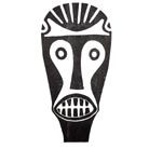
The first impressions i got was someone running through a jungle, where he comes across many things. The film "apocalypto" came into mind, simple because of its tribe theme and its story within the film.

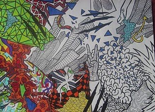
These are random images which i think relate to the soundtrack of "Tribal".


first impressions when listening to the "tribal" track is obviously tribesman. It has an African tribe relation, because of the sounds that are created.
I instantly thought of a person running through a wild jungle coming across all kinds of things. The sound track features a main person who is singing, and then a few more people start singing.

The tune is bouncy, with energetic beats.

Wednesday 9 March 2011

landscape...landscape....NO its portrait.


Having printed 2 a2 prints today i soon realised later on that the poster needed to be portrait, so i have altered parts to make it portrait. This took a little time, but much happier than the landscape design.

The first poster showed was a landscape poster with darker parts.
I was much happier with the second landscape poster because of the alteration with brightness.
Soon, i realised it need to be portrait, so i have altered it again to suit the projects needs.

FINALz...GF Smith poster


The bottom poster is slightly dark to the above design. I played around with the lighting to see what effect i would create. Having the 3 balloons makes it stand out a little more because of the colours used, as well as the techniques shown from the letter-forms and triangles.

finalzz...GF Smith poster!


Images shown from close-up and different angles.
What i found difficult in the making of this design what shaping up the triangles to form an "A4" like-paper. Scoring the smaller triangles was the most difficult because of its size.

Scoring out the letters was quite simple, however when it came to the curves, i found it quite difficult. Bending the curves was tricky because as soon as you bend one side, the other side becomes uneven, but the effect is still shown.

From the beginning of the project i said i was very interested in the idea of having triangles as a way of showing this design....and so, i have. I have also employed the triangle in my letter forms by using it as the letter "A" to make it more simple. As for the "E" i have shown this by placing 3 equal dashed. The letter forms are clear and simple, yet effective because of the shadow created
from the scores.

just realised it has to be at portrait format! :/

finalzz...GF Smith poster!


The bottom two show a quick idea of what the final design will look like. However i still need to play with the idea of layouts. I particularly like the idea or having 2/3 balloons at the top, this has a simplistic effect yet still effective because of the colours used. Having light being shone onto the design makes it a little more exciting. This is shown from the scores on the paper.

finalzz...GF Smith poster!


The top two show a messy effect but still is an eye-catcher.
I came up with many ideas development towards this design shown in my sketch book.

GF Smith paper


From looking at the GF Smith website i came across this image on the left which shows red text. I has inspired by the text and so i developed ideas where i can produce something simple like this yet still having that exciting effect.

As you can see there are multiple selection, showning a Colorplan, which is a classic collection of coloured papers and boards available in 56 colours,
8 weights and 25 embossings.

As well as having such a simple yet effective design, to celebrate the 100 years of GF Smith Celebrations, i have place 3 balloons consisting of the green and red colour. having balloons will show signs of some part of celebration or party. Having added colour to the design will grab peoples attention.

Sunday 6 March 2011

research for GF Smith paper - looking at Milton Glaser


Milton Glaser is a graphic designer, best known for the "I Love New York" logo, his "Bob Dylan" poster, the "DC bullet" logo used by DC Comics from 1977 to 2005, and the "Brooklyn Brewery" logo.

As you can see with the "NY" logo, he has used simple type to get the message across. Instead of love as a word, he has used an imagery logo for this.

The other imagery which shows white lettering and black lettering together is something which i like because of its simplicity. For example for "A" it is a triangle. I have been inspired by his simplistic way, and i will continue to develop my own style but include ideas from these letter forms.

Another design, which i like, shows a colorful piece of a woman and texts saying "ARETHA". Again he have used a simple shape, i.e. "A" as a triangle. The colors used are vibrant and eye catching

The reason why i picked out this piece is because of its black background, and the way it complements the actual image as well as the text.